If you are using an ecommerce site to host your website, one of our other integration options may be more appropriate. For more information, please see the integration page. Alternatively, if you do not want to use the ecommerce integration options, you can integrate Zyler Go directly. This is a more technical solution but it offers more flexibility.
It is possible that, due to restrictions in your ecommerce site, you may not be able to integrate via direct integration. For example, your site may prevent custom classes or attributes from being added to elements which are necessary for the direct integration to work. If you experience these issues, please contact us at api@zyler.com and we will do our best to help.
To find an example of how Zyler Go will look on your website please see the overview.
The steps for integrating Zyler Go directly on your website are as follows:
Step 1: Including the Script
Copy the code snippet below and paste it just before the closing </head> tag on your website, ensuring that the defer attribute is used so the script is only processed after all other DOM processes have fully loaded. Make sure to replace <partner-id> with the value found within the Partner Portal, e.g. pp937797c2c4c43fb89211342f.
<script defer partner-id="<partner-id>" src="https://www.zyler.com/js/go-integration/v1/index.js"></script>
Step 2: Including the Try On Buttons
Edit your webpages to add Try On buttons to the PLP and PDP with the following attributes:
class="zyler-try-on-cta"wherezyler-try-on-ctais used by the script to locate the Try On button.data-outfit-handle="<outfit-handle>"where<outfit-handle>is replaced by your product id, which must correspond to the product id field on each outfit in the Partner Portal.style="visibility:hidden"is required to keep the button hidden until some behind-the-scenes checks have completed so that it can be made visible only if the outfit is ready for visualization.- Further CSS styling can be applied to the button to fit with your website.
In the following example, the button appears under the "Add to Bag" button on the PDP:
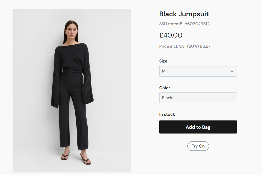
For the Try On button in the above, if the url for the product is something like "test-site.com/products/totem5-p606029512" then the button element would use the following values:
<button class="zyler-try-on-cta" data-outfit-handle="totem5-p606029512" style="visibility:hidden">Try On</button>
Step 3: Styling Using CSS
For the example screenshot above, the CSS used to style the buttons is as follows:
<style>
  .zyler-try-on-cta {
    display: block;
    border: 1px black solid;
    border-radius: 2rem;
    padding: 0.5rem 1rem;
    margin: 0;
    background-color: white;
    cursor: pointer;

    &:hover {
      background-color: #f0eff0;
    }
  }
</style>
This is just an example to illustrate how the buttons could be styled. As mentioned previously, this solution offers complete flexibility in that the content, position and style of the buttons are in your control.
This completes the integration steps. Zyler Go is now part of your site.