Overview
The following examples show how Zyler Go will look when you integrate it into your Shopify site. The next section explains the steps required to achieve this. These steps are supported by screenshots to help you get up and running.
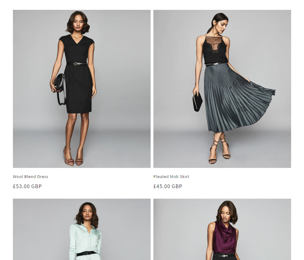
Imagine your PLP on desktop looks something like the following:
After integrating Zyler Go, "Try On" buttons will then appear below the product:
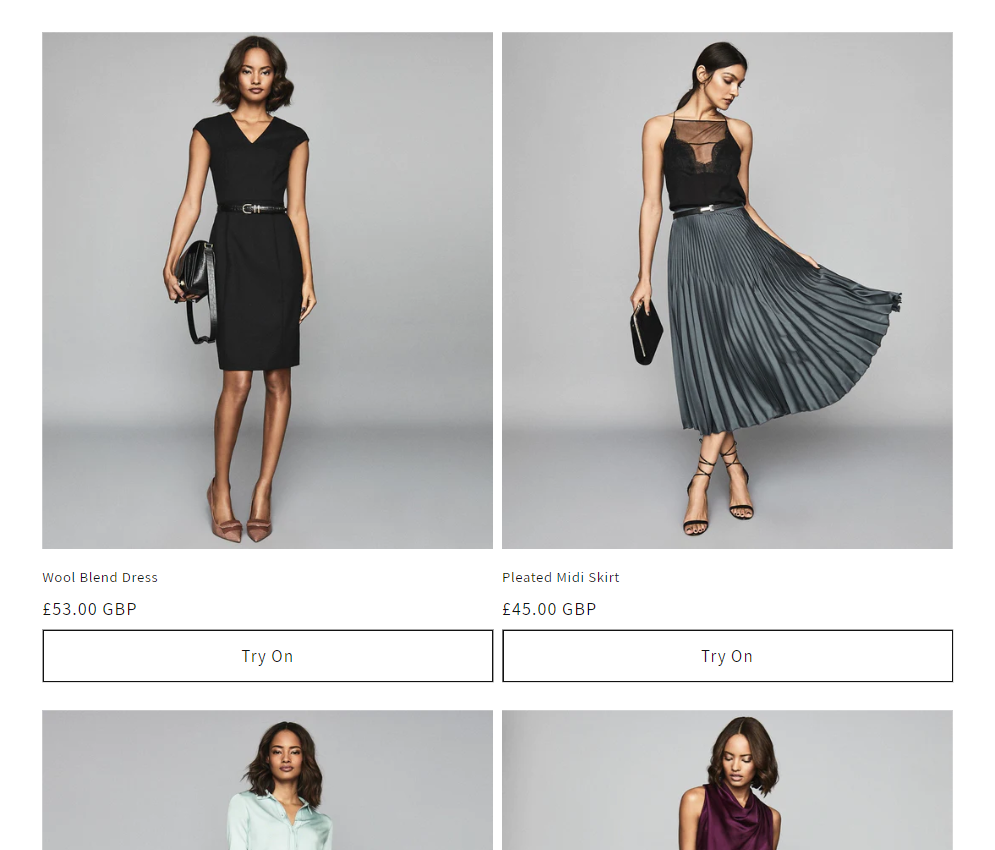
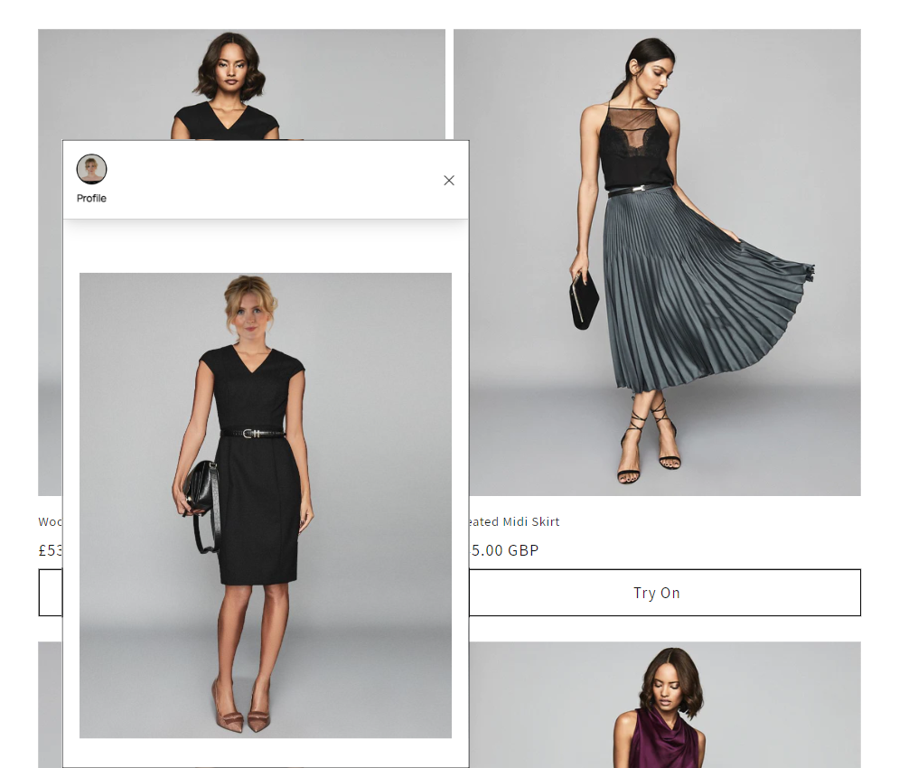
These "Try On" buttons can be customized to match the brand of your website as you see fit. Upon clicking the "Try On" button for an outfit, the Zyler Go widget will be displayed in the bottom left of the window showing the user visualized in that outfit. For example:
On mobile, the widget will occupy the whole screen as can be seen below:
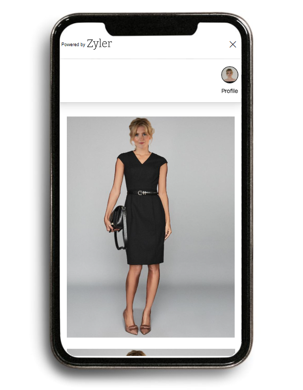
In both views, you are able to swipe vertically to view all your other outfits that are available for visualization.
As with the PLP, integrating Zyler Go on the PDP will add "Try On" buttons. Imagine your PDP on desktop looks like the following (before integrating Zyler Go):
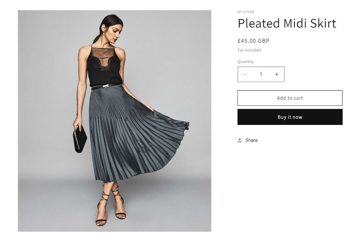
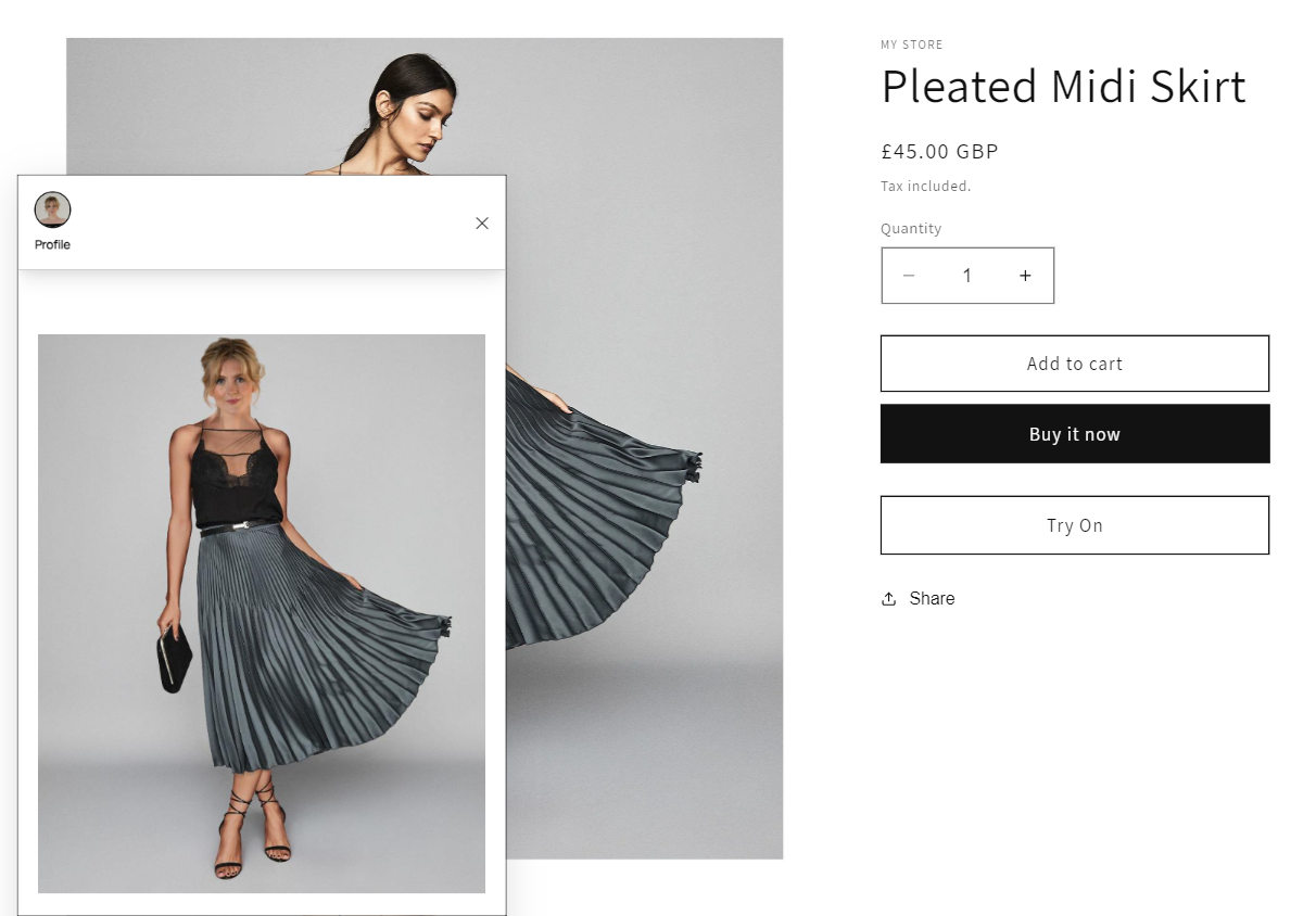
After integrating Zyler Go, the "Try On" button will be displayed. You have the flexibility to decide the text, position and styling of these buttons as you see fit. In this example, these buttons appear under the "Buy it now" button on the PDP, as shown below:

As before, upon clicking the "Try On" button, the Zyler Go widget will be displayed with the outfit visualized on the user. For example:
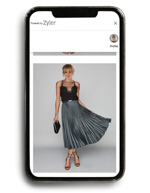
On mobile once again, the widget will occupy the whole screen as can be seen below:
Integration Steps
There are three simple steps for integrating Zyler Go on Shopify:
Step 1: Including the Script
Copy and paste the script before the closing </head> tag in the "themes.liquid" file. To do this:
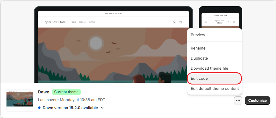
- Navigate to "Sales channels" -> "Online Store" -> "Themes".
- Find your current theme, click on the three dots to the right of it and select "Edit code" as shown below:
- Use the search facility to find the file named "theme.liquid" which is in the "layout" folder.
- Within this file you will be finding the right place to paste the script, which should be just before the closing
</head>tag. Use the search function to search the file for "</head>", as follows:
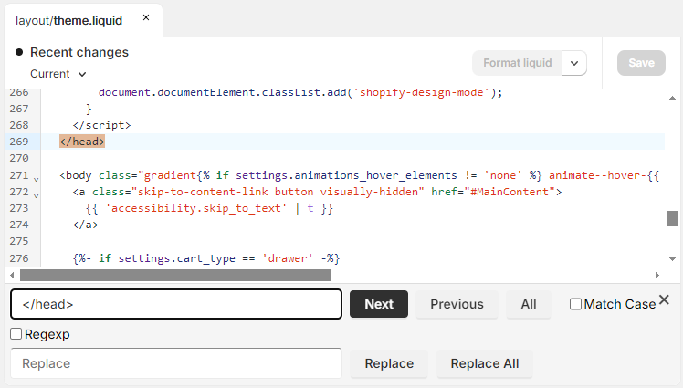
- Now that you have found this location, on a new line above this closing
</head>tag paste the following script, replacing<partner-id>with your value from the Partner Portal:
<script defer partner-id="<partner-id>" src="https://www.zyler.com/js/go-integration/v1/index.js"></script>
The script uses the defer attribute which is recommended for use if including scripts in the <head>. This ensures the script does not run until the browser has finished loading the page content.
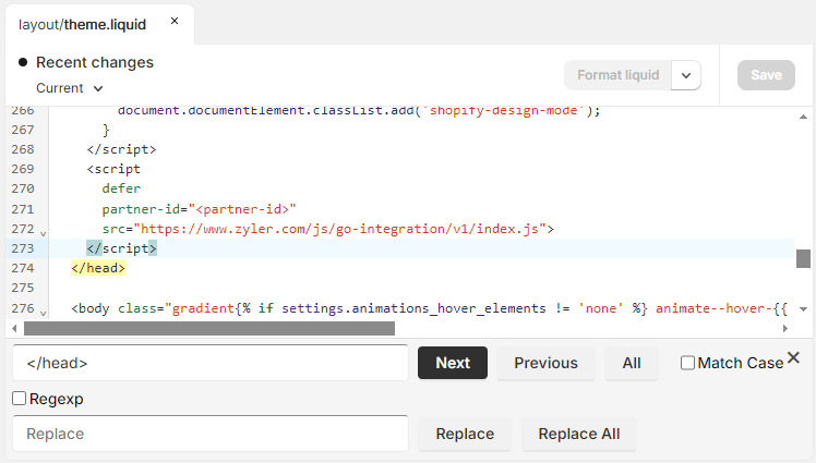
The next image shows how this file looks with the addition of the script code:
- Click "Save".
Step 2: Styling Using CSS
To style your "Try On" buttons, copy and paste the following CSS into the same section as the script, either above or below it. You can edit it to match the brand of your website as you see fit.
<style>
  .zyler-try-on-cta {
    width: 100%;
    background-color: white;
    cursor: pointer;
    position: relative;
    z-index: 2;
    border: 1px solid black;

    &:hover {
      background-color: #f0eff0;
    }
  }
</style>
Alternatively, if you are comfortable using DevTools and familiar with HTML, you can match the style of other buttons in your theme by inspecting elements. Look for the classes used on elements like "Add to Cart" and apply those to the class list of the "Try On" button. We will also be covering this later on in this document.
For example, in the Dawn theme, your button code would look like following:
<button class="zyler-try-on-cta zyler-hide button button--full-width button--secondary" data-outfit-handle="{{card_product.handle}}">Try On</button>
Paid themes may use classes such as those used in the snippet below:
<button class="zyler-try-on-cta zyler-hide btn btn--full btn--secondary" data-outfit-handle="{{card_product.handle}}">Try On</button>
Check the Shopify theme support for further guidance on your own theme.
Step 3: Customizing your Theme
The PLP and PDP need to be customized separately:
PLP Customization
In these examples, the free Shopify theme "Dawn" is used. The names of the files being edited in each section may differ if you are using a paid theme.
- Navigate to "Sales channels" -> "Online Store" -> "Themes".
- Find your current theme, click on the three dots to the right of it and select "Edit code" as follows:
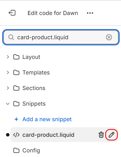
- Here you need to use the search facility to find the file which represents your product card that appears on the catalog page. Paid themes may name this file "product-card.liquid" or "product-grid-item.liquid". In free Shopify themes such as Dawn, this file is called "card-product.liquid" and is listed inside of the snippets folder. Once you have located the correct file, click the pencil icon to edit it, as highlighted below:
- The next step is to find a suitable location within the product card file to put the button. You will likely need to experiment with different positions to see what works best for your theme. For assistance in finding the best location for the button in your specific theme, refer to the Shopify theme support to contact the theme creator. In paid themes you could try searching for
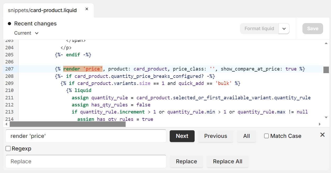
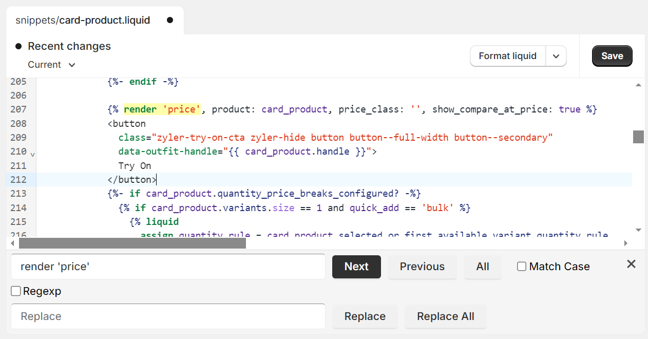
product-description,description,product-information,information, or a similar identifier, where an element may contain it as the class, e.g.class="product-description". In our example, the button appears under the product price. With the free Shopify themes, this was achieved by searching for the wordpricewhere we were looking for the first occurrence ofrender 'price', as shown below:
- Now that you have found the location in the product card for the button code, here is when you need to paste in the code to allow you to "Try On" the outfits, subject to them being ready in the system. In order for the integration to know which outfit is being referred to, the Shopify Liquid variable corresponding to the handle is needed as the value for
data-outfit-handlein the snippet below. In paid themes, this variable may be calledproduct.handle, in free themes like Dawn, it is calledcard_product.handle. You can check for the correct name by examining the other variables in the file. The following snippet represents the button for Dawn, copy and paste this on a new line in the location found in the previous step, replacing any variables as required to work with your theme:
<button class="zyler-try-on-cta zyler-hide button button--full-width button--secondary" data-outfit-handle="{{card_product.handle}}">Try On</button>
The next image shows how the file looks for Dawn with the addition of the button code:
- Click "Save".
PDP Customization
In these examples, the free Shopify theme "Dawn" is used. The names of the files being edited in each section may differ if you are using a paid theme.
- Navigate to "Sales channels" -> "Online Store" -> "Themes".
- Click "Customize" on your current theme.
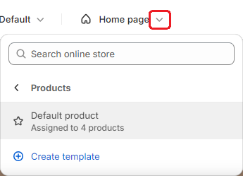
- Access your PDP by using the dropdown in the top middle of the screen and navigate to "Products" -> "Default product", as below:
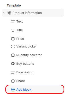
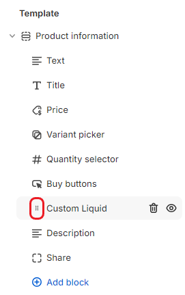
- Under "Template" on the left of the screen, find "Product information" and click "Add block", see the following screenshot:
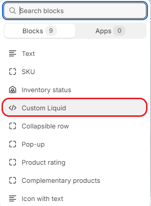
- Here you need to add some custom code. Depending on your theme this block could be called "Liquid" or "Custom Content", but with the Dawn theme you select "Custom Liquid" from the list of blocks:
- Click into the new Custom Liquid block and copy and paste the following code into the "Liquid code" textbox:
<button class="zyler-try-on-cta zyler-hide button button--full-width button--secondary" data-outfit-handle="{{product.handle}}">Try On</button>
- As mentioned previously, you have control over the position, text and style of these buttons. Use the drag handle in the following image to rearrange your blocks as you see fit for your site. In the examples above, the button is positioned underneath the "Buy it now" button:
- Click "Save".
This completes the integration steps. Zyler Go is now part of your Shopify site.